Posted by Zoompf
As we know well by now, the speed of a web page is very important from an SEO and user experience perspective. Faster pages have higher search engine ranks, and users will visit more pages and convert higher on a fast performing website. In short, the smart SEO professional needs to also think about optimizing for performance as well as content.
As we discussed in our last article, WebPageTest is a great free tool you can use to optimize your website performance. One of the most useful outputs of the WebPageTest tool is a graphic known as the waterfall diagram. A waterfall diagram is a graphical view of all the resources loaded by a web browser to present your page to your users, showing both the order in which those resources were loaded and how long it took to load each resource. Analyzing how those resources are loaded can give you insight into what's slowing down your webpage, and what you can fix to make it faster.
Waterfall diagrams are a lot like Microsoft Excel: they are simple in concept and can be very powerful, yet most people aren't using them to their fullest potential. In this article, we will show how an SEO professional can use waterfall diagrams created by tools like WebPageTest to identify and improve their site's performance and user experience.
How to read a waterfall diagram
If you haven't done so already, go to WebPageTest and run a test of your site. When the results are finished, click into the first test result to see the waterfall. Below is a sample waterfall chart (click for a larger version).

As mentioned above, waterfall diagrams are cascading charts that show how a web browser loads and renders a web page. Every row of the diagram is a separate request made by the browser. The taller the diagram, the more requests that are made to load the web page. The width of each row represents how long it takes for the browser to request a resource and download the response.
For each row, the waterfall chart uses a multi-colored bar to show where the browser spent its time loading that resource, for example:
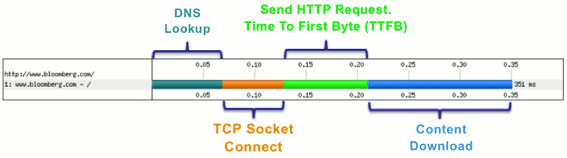
It's important to understand each phase of a request since you can improve the speed of your site by reducing the amount of time spent in each of these phases. Here is a brief overview:
- DNS Lookup [Dark Green] - Before the browser can talk to a server it must do a DNS lookup to convert the hostname to an IP Address. There isn't much you can do about this, and luckily it doesn't happen for all requests.
- Initial Connection [Orange] - Before the browser can send a request, it must create a TCP connection. This should only happen on the first few rows of the chart, otherwise there's a performance problem (more on this later).
- SSL/TLS Negotiation [Purple] - If your page is loading resources securely over SSL/TLS, this is the time the browser spends setting up that connection. With Google now using HTTPS as a search ranking factor, SSL/TLS negotiation is more and more common.
- Time To First Byte (TTFB) [Green] - The TTFB is the time it takes for the request to travel to the server, for the server to process it, and for the first byte of the response to make it make to the browser. We will use the measurement to determine if your web server is underpowered or you need to use a CDN.
- Downloading (Blue) - This is the time the browser spends downloading the response. The longer this phase is, the larger the resource is. Ideally you can control the length of this phase by optimizing the size of your content.
You will also notice a few other lines on the waterfall diagram. There is a green vertical line which shows when "Start Render" happens. As we discussed in our last article, until Start Render happens, the user is looking at a blank white screen. A large Start Render time will make the user feel like your site is slow and unresponsive. There are some additional data points in the waterfall, such as "Content Download", but these are more advanced topics beyond the scope of this article.
Optimizing performance with a waterfall diagram
So how do we make a webpage load more quickly and create a better user experience? A waterfall chart provides us with 3 great visual aids to assist with this goal:
- First, we can optimize our site to reduce the amount of time it takes to download all the resources. This reduces the width of our waterfall. The skinnier the waterfall, the faster your site.
- Second, we can reduce the number of requests the browser needs to make to load a page. This reduces the height of our waterfall. The shorter your waterfall, the better.
- Finally, we can optimize the ordering of resource requests to improve rendering time. This moves the green Start Render line to the left. The further left this line, the better.
Let's now dive into each of these in more detail.
Reducing the width of the waterfall
We can reduce the width of the waterfall by reducing how long it takes to download each resource. We know that each row of the waterfall uses color to denote the different phases of fetching a resource. How often you see different colors reveals different optimizations you can make to improve the overall speed.
-
Is there a lot of orange? Orange is for the initial TCP connection made to your site. Only the first 2-6 requests to a specific hostname should need to create a TCP connection, after that the existing connections get reused. If you see a lot of orange on the chart, it means your site isn't using persistent connections. Below you can see a waterfall diagram for a site that isn't using persistent connections and note the orange section at the start of every request row.
 Once persistent connections is enabled, the width of every request row will be cut in half because the browser won't have to make new connections with every request.
-
Are there long, purple sections? Purple is the time spent performing an SSL/TLS negotiation. If you are seeing a lot of purple over and over again for the same site, it means you haven't optimized for TLS. In the snippet of diagram below, we see 2 HTTPS requests. One server has been properly optimized, whereas the other has a bad TLS configuration:
 To optimize TLS performance, see our previous Moz article .
 -
Are there any long blue sections? Blue is the time spent downloading the response. If a row has a big blue section, it most likely means the response (the resource) is very large. A great way to speed up a site is to simply reduce the amount of data that has to be sent to the client. If you see a lot of blue, ask yourself "Why is that resource so large?" Chances are you can reduce the size of it through HTTP compression, minification, or image optimization. As an example, in the diagram below, we see a PNG image that is taking a long time to download. We can tell because the of the long blue section.
 Further research revealed that this image is nearly 1.1 MB in size! Turns out the designer forgot to export it properly from Photoshop. Using image optimization techniques reduced this row and made the overall page load faster.
 - Is there a lot of green? Chances are there is a lot of green. Green is the browser just waiting to get content. Many times you'll see a row where the browser is waiting 80 or 90 ms, only to spend 1 ms downloading the resource! The best way to reduce the green section is to move your static content, like images, to a content delivery network (CDN) closer to your users. More on this later.
Reducing the height of the waterfall
If the waterfall diagram is tall, the browser is having to make a large number of requests to load the page. The best way to reduce the number of requests is to review all the content your page is including and determine if you really need all of it. For example:
- Do you see a lot of CSS or JavaScript files? Below is a snippet of a waterfall diagram from an AOL site which, I kid you not, requests 48 separate CSS files!
 If you site is loading a large number of individual CSS or JavaScript files, you should try combining them as with a CMS plugin or as part of your build process. Combining files reduces the number of requests made, improving your overall page speed.
 - Do you see a lot of "small" (less than 2kb) JavaScript files or CSS files? Consider including the contents of those files directly in your HTML via inline <script>, <code>, or <style> tags.
- Do you see a lot of 302 redirects? Redirects appear as yellow highlighted rows and represent links on your page that are usually outdated or mistakenly made. This creates an unnecessary redirect which is just needlessly increasing the height of your waterfall. Replace those links with direct links to the new URLs.
Improving rendering time
Recall that the Start Render time represents when the user first sees something on the page other than a blank white page.
What is your Start Render time? If its longer than 1.5 seconds, you should try and improve it. To do so, first take a look at all the resources "above and to the left" of the Start Render line. This represents everything that should be considered for optimization to improve your render time.
Here are some tips:
- Do you see any calls to load JavaScript libraries? JavaScript includes can block page rendering, move these lower in your page if possible.
- Do you see a lot of requests for separate CSS items? Browsers wait until all the CSS is downloaded before they start rendering the page. Can you combine or inline any of those CSS files?
- Do you see external fonts? When using an external font, the browser won't draw anything until it downloads that font. If possible, try to avoid using externally loaded fonts. If that is not possible, make sure you are eliminating any unnecessary 302 redirects to load that font, or (even better) consider hosting a copy of that font locally on your own webserver.
As an example, here is the top of a waterfall diagram:

The green start render line is just over 1 second which is pretty good. However, if you look to the left of the line, you can see some optimizations. First, there are multiple JS files. With the exception of jQuery, these can probably be deferred until later. There are also multiple CSS files. These could be combined. These optimizations would improve the start render time.
You may need to coordinate with your designers and your developers to implement these optimizations. However the results are well worth it. No one likes looking at an empty white screen!
Other factors
Is my server fast enough?
We know that the time-to-first-byte from your server is a factor in search engine rankings. Luckily a waterfall tells you this metric. Simply look at the first row of the diagram. This should show you timing information for how the browser downloads the base HTML page. Look at the TTFB measurement. If it is longer than about 500 ms, your server may be underpowered or unoptimized. Talk with your hosting provider to improve your server capabilities. Below is an example of a waterfall diagram where the server was taking nearly 10 seconds to respond! That's a slow server!

Do I need a CDN?
Latency can be a big source of delay for a website, and it has to do with the geographic distance between your server and your website visitors. As we have discussed, latency is driven by distance and the speed of light; a high speed internet connection alone doesn't fix the problem. Content Delivery Networks (CDNs) speed up your website by storing copies of your static assets (images, CSS, JavaScript files, etc) all over the world, reducing the latency for your visitors.
Waterfalls reveal how latency is affecting the speed of your site, and whether you should use a CDN. We can do this by looking at the TTFB measurements for requests the browser makes to your server for static assets. The TTFB is composed of the time it takes for your request to travel to the server, for the server to process it, and for the first byte of the response to come back. For static assets, the server doesn't have to do any real processing of the request, so the TTFB measurement really just tells us how long a round-trip takes from a visitor to a user. If you are getting high round-trip numbers it means your content is too far away from your visitors.
To determine if you need a CDN, you first need to know the location of your server. Next, use WebPageTest and run a test from a location that is far away from your server. If your site is hosted in the US, run a test from Asia or Europe. Now, find the rows for requests for several images or CSS files on your server and look at the TTFB measurement. If you are getting a TTFB for static content that is more than 150 ms, you should consider a CDN. For commercial sites, you might want to look at the enterprise grade capabilities of Akamai. For a cheaper option, check out CloudFlare which offers free CDN services.
Summary
Believe it or not, we have only scratched the surface of the performance insights you can learn from a waterfall chart. However this should be more than enough to begin to understand how to read a chart and use it to detect the most basic and impactful performance issues that are slowing down your site.
You can reduce the width of the chart by optimizing your content and ensuring that each resource is received as quickly as possible. You can reduce the height of the waterfall by removing unneeded requests. Finally, you can speed up how quickly your users first see your page by optimizing all the content before the Start Render line.
If you're still not sure where to start, check out Zoompf's Free Performance Report to analyze your site and prioritize those fixes that will make the biggest impact on improving your page speed and waterfall chart metrics.
Sign up for The Moz Top 10, a semimonthly mailer updating you on the top ten hottest pieces of SEO news, tips, and rad links uncovered by the Moz team. Think of it as your exclusive digest of stuff you don't have time to hunt down but want to read!
No comments:
Post a Comment